August 29, 2011 - He's back! 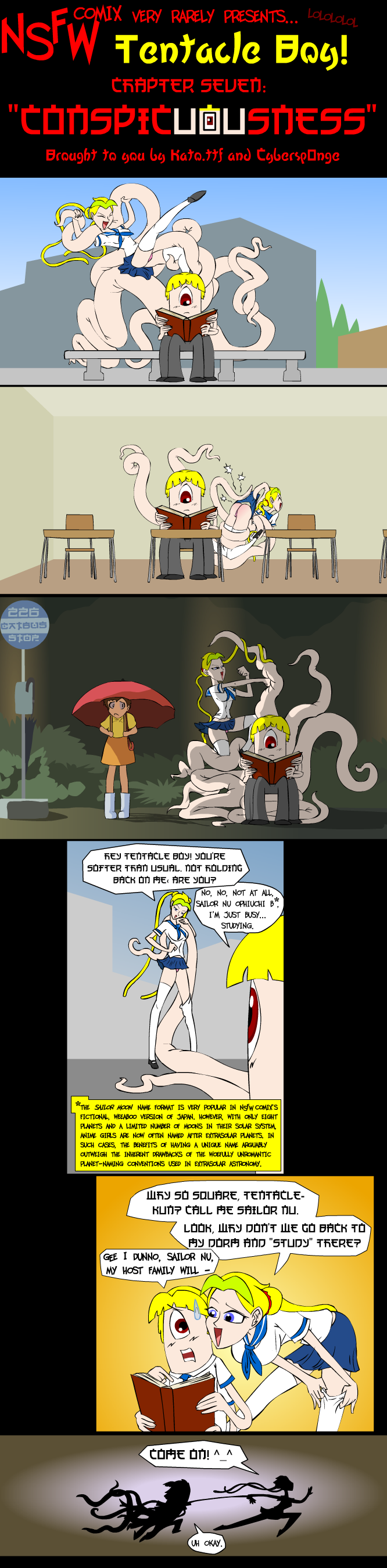 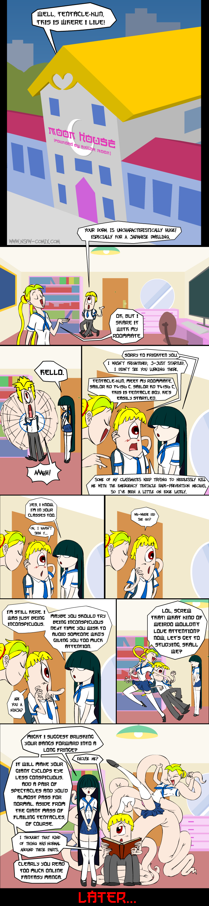 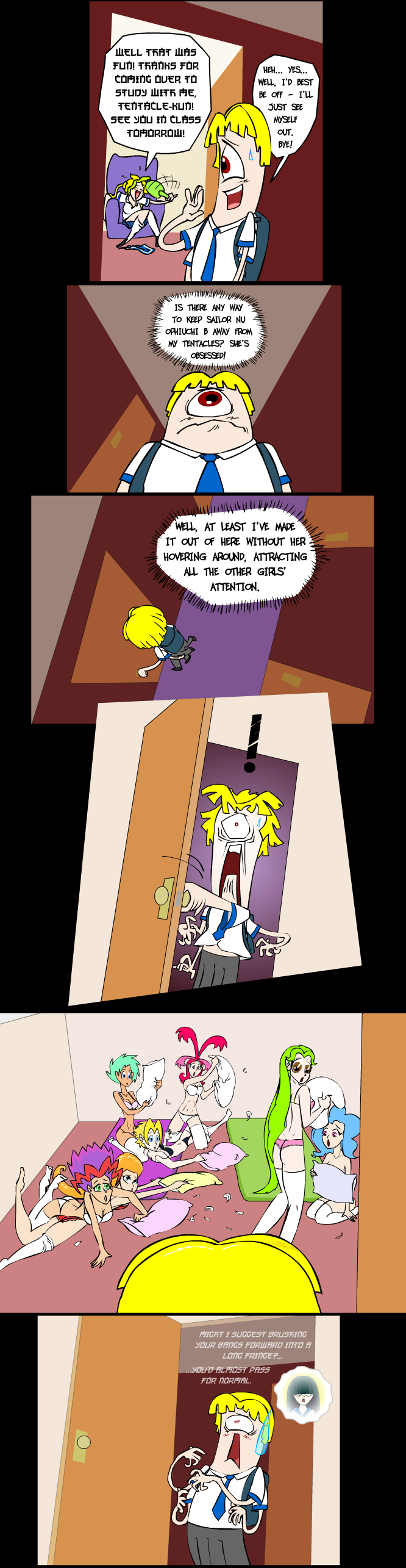 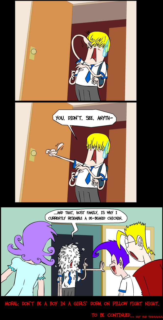
Tweet
I didn't actually spend 2 weeks making this, I was just away on business fighting zombies in a parallel universe of pure evil. The Tentacle Boy series' new Japanese-styled font, "Kato", isn't much better than its predecessor "Hirosh", but I hope you can still read it alright. The H's look like K's, but otherwise it's okay, I think. Just ask in the shoutbox below if you can't figure it out. Nobody will mock you, but they might mock me for my choice of font.
No money? Votes for this site are good as gold! 
|


(C)2011, 2010, 2009, 2008, 2007, 2006, 2005 NSFW Comix LTD.